ImplementationFrom two identities to one monolithic brand
ImplementationA rebranding following the merger of two municipalities
ImplementationRebranding of leading healthcare provider for individuals with intellectual disabilities
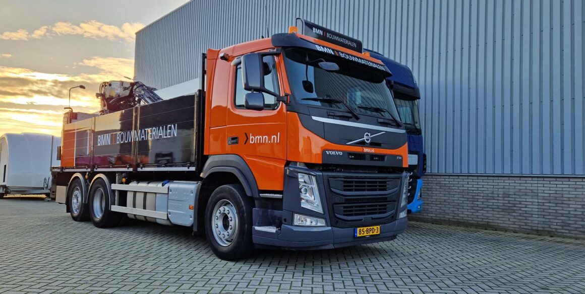
ImplementationRebranding the fleet as well as materials
ImplementationA rebranding following the merger of two municipalities
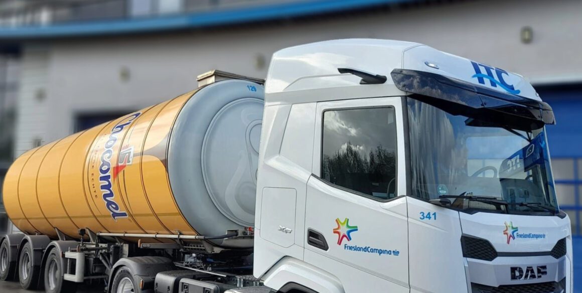
Implementation25 tank trailers transformed into moving Chocomel cans
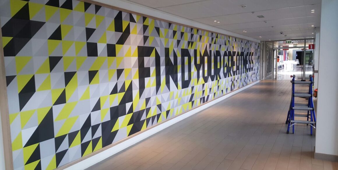
ImplementationCreating an inspiring work environment through interior branding
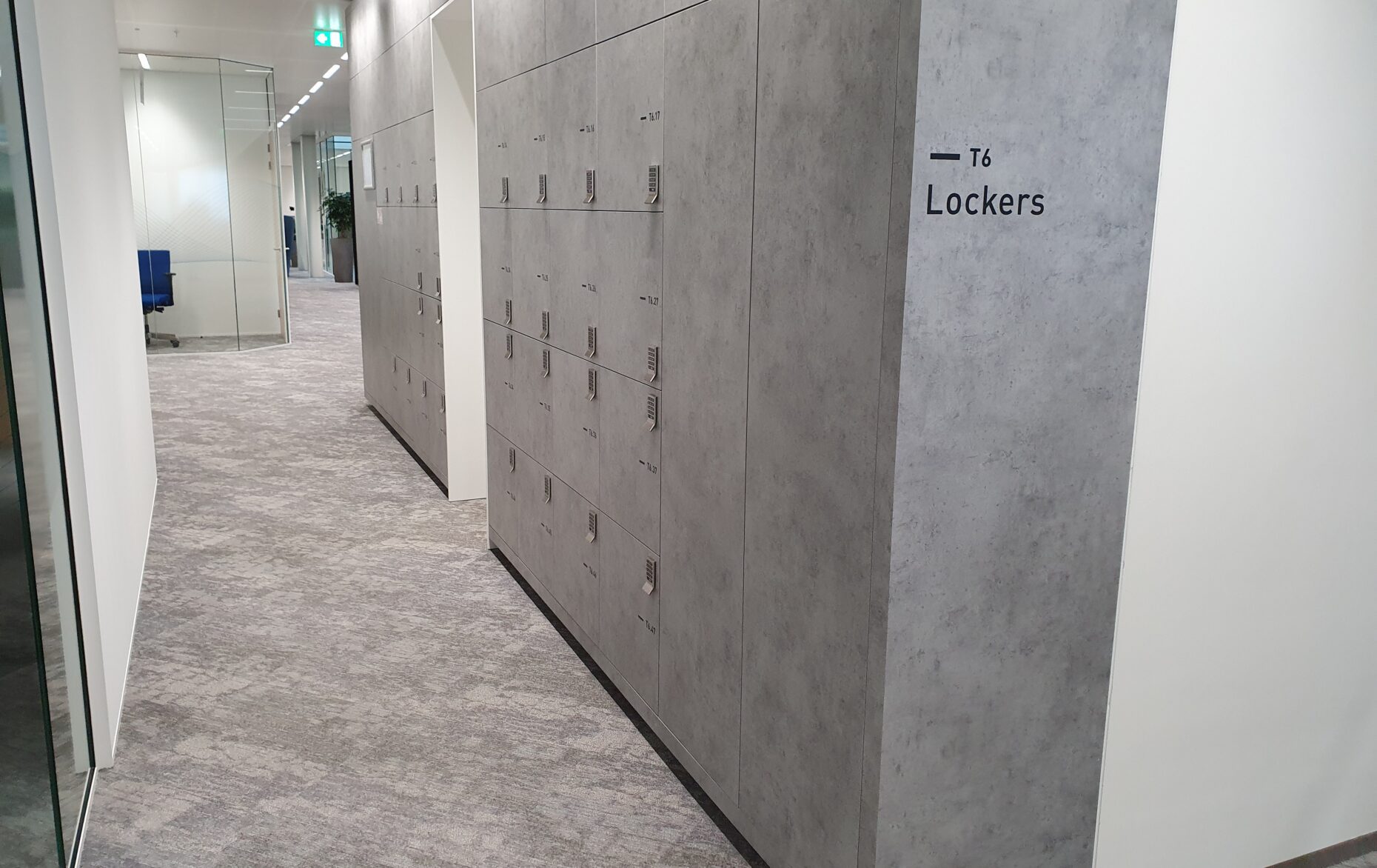
ImplementationRealization and implementation of a distinctive identity in wayfinding
ImplementationCreating an inspiring environment for creative food enthusiasts with interior branding
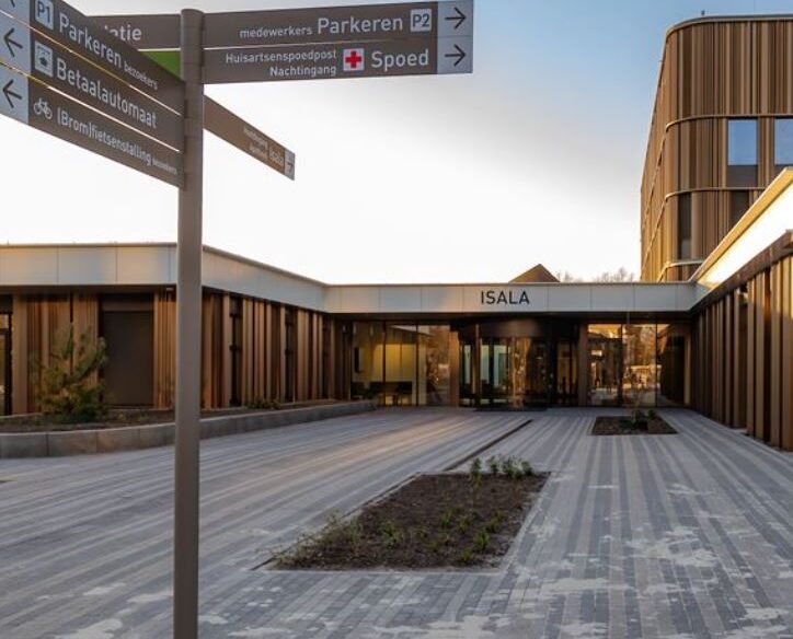
ManagementSurgical-level signage for ZNA Cadix hospital in Antwerp
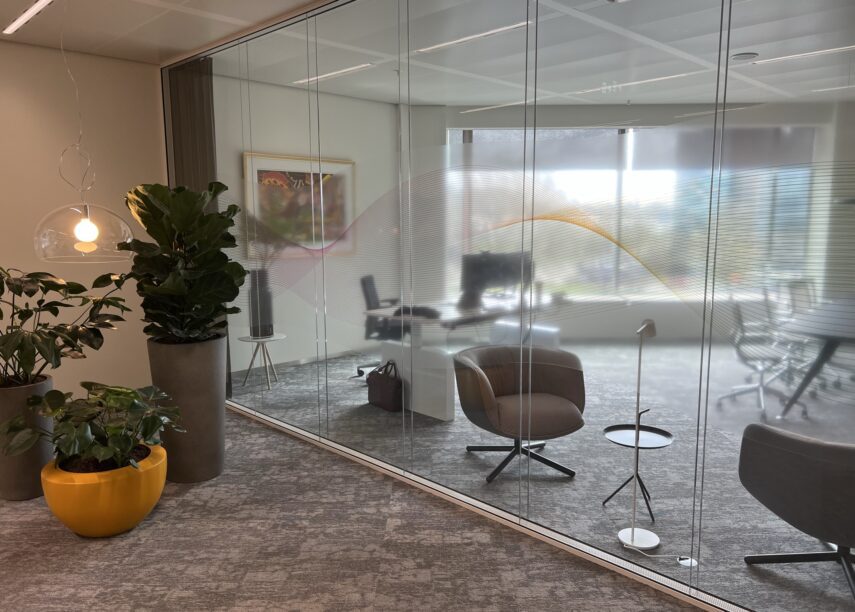
ImplementationA Transparent Vision on Privacy and Interior Branding
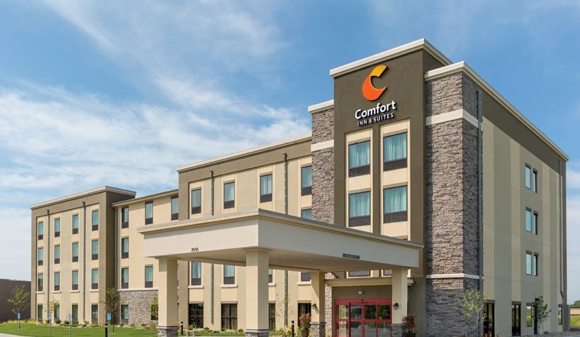
ImplementationChoice Hotels shines—200+ locations, one strong brand
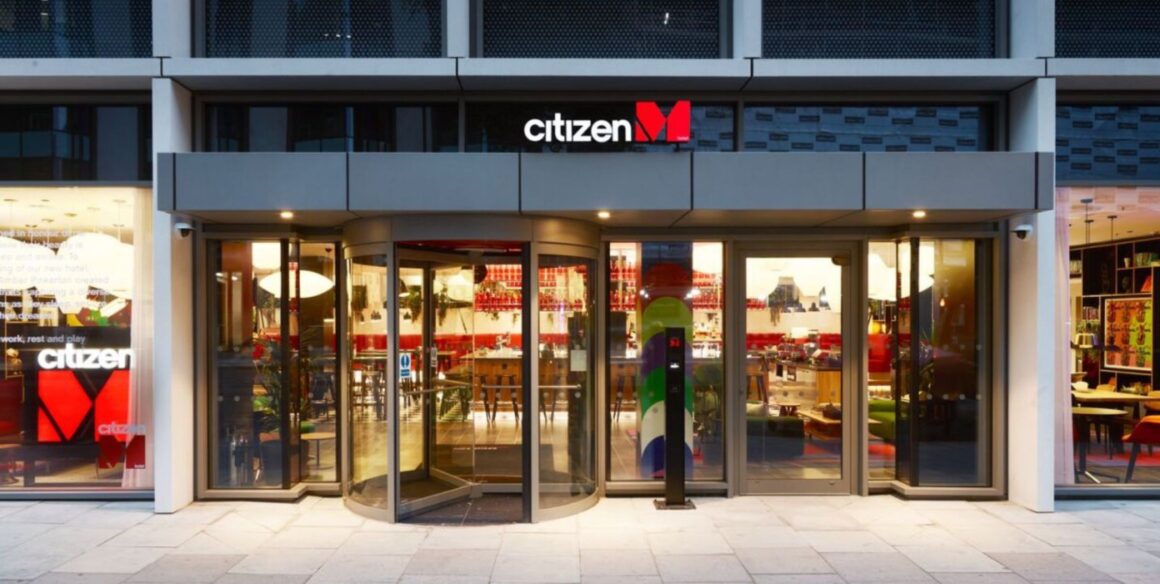
ImplementationOne-of-a-kind hotel concept translated to multiple international hotels
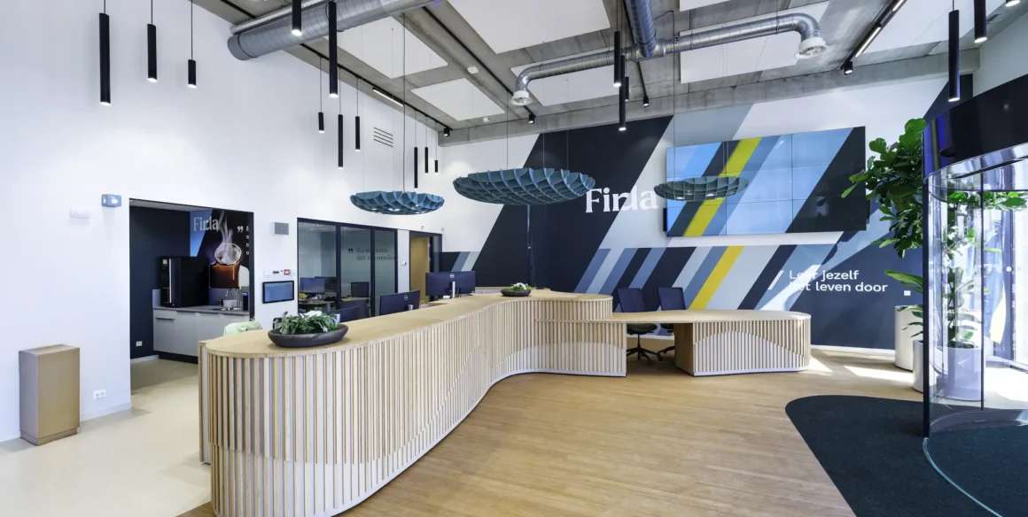
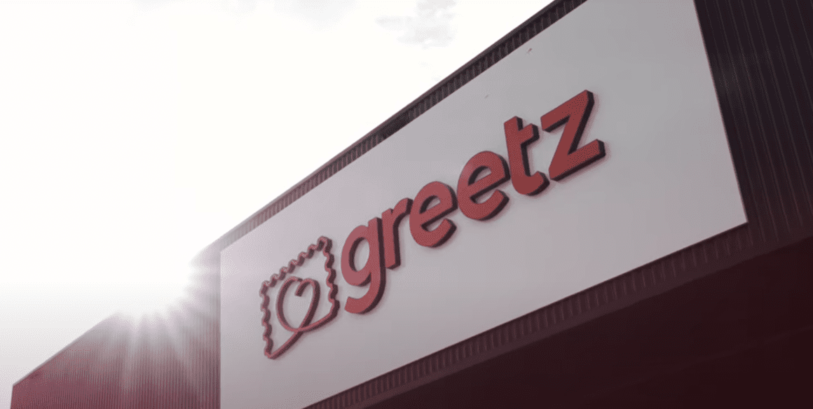
ImplementationThe Greetz feeling as a red line in the 'employee' branding
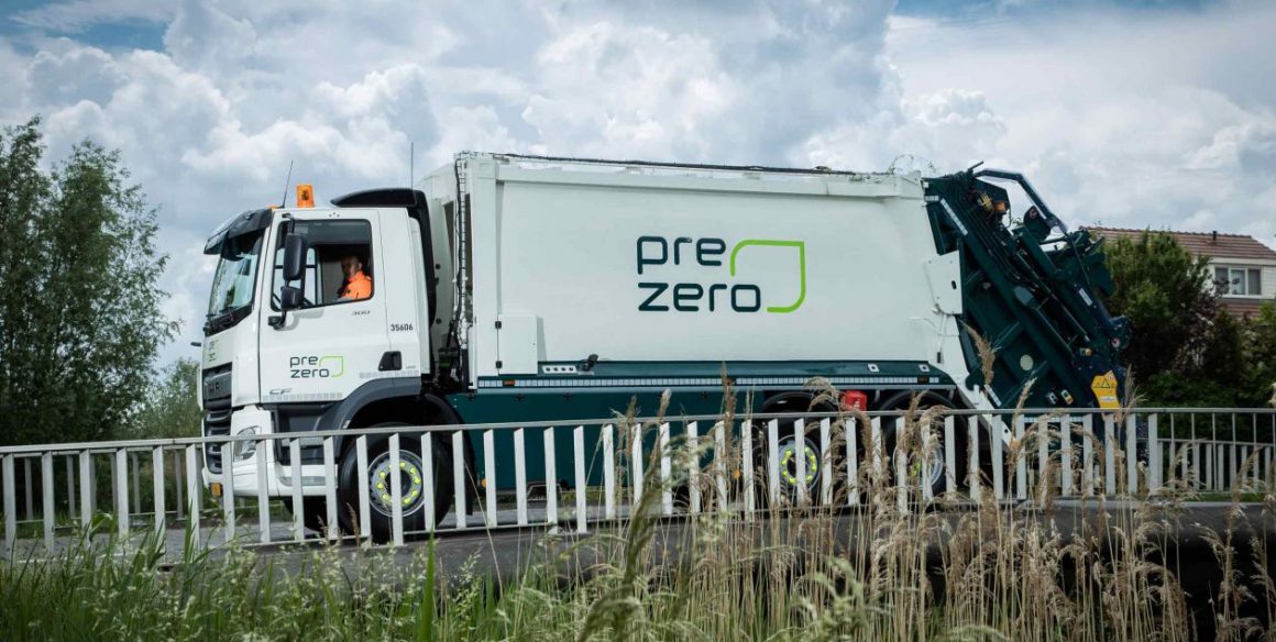
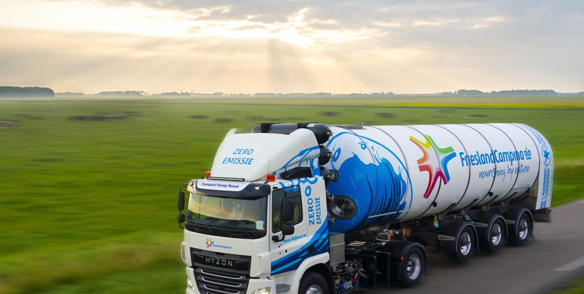
ImplementationRenewal on the road and beyond
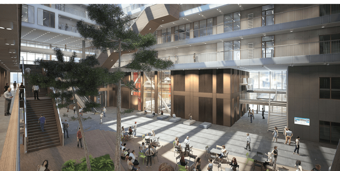
ManagementCreating a campus feeling for nearly 30,000 students
ManagementInnovative brand management built on a great working relationship
ManagementInnovative, academic-style wayfinding and signage
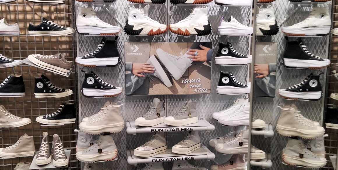
ImplementationEffective instore campaigns for 600+ stores
ImplementationInstore brand and marketing campaigns
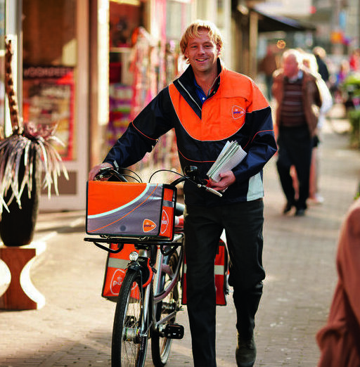
ImplementationFrom TNT Post to PostNL: minimum disruption, maximum impact
ImplementationA flawless rebranding across 300 stores
ImplementationA strong brand as a foundation for effective positioning
ImplementationFrom seven districts to one unified brand identity
OrientationBrand consistency across hundreds of European locations
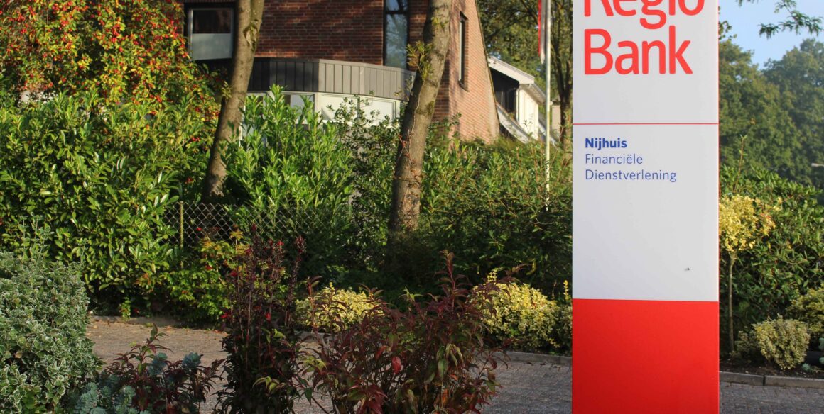
ImplementationRegioBank rebranding—500+ locations, one strong brand identity
 Skip to content