Intertrust: A Transparent Vision on Privacy and Interior Branding

| Project | Interior branding hand in hand with privacy and functionality |
| Scope | Intertrust headquarters in Amsterdam |
| Challenge | Integrating the new Intertrust corporate identity into the office in an attractive way, ensuring both privacy and transparency |
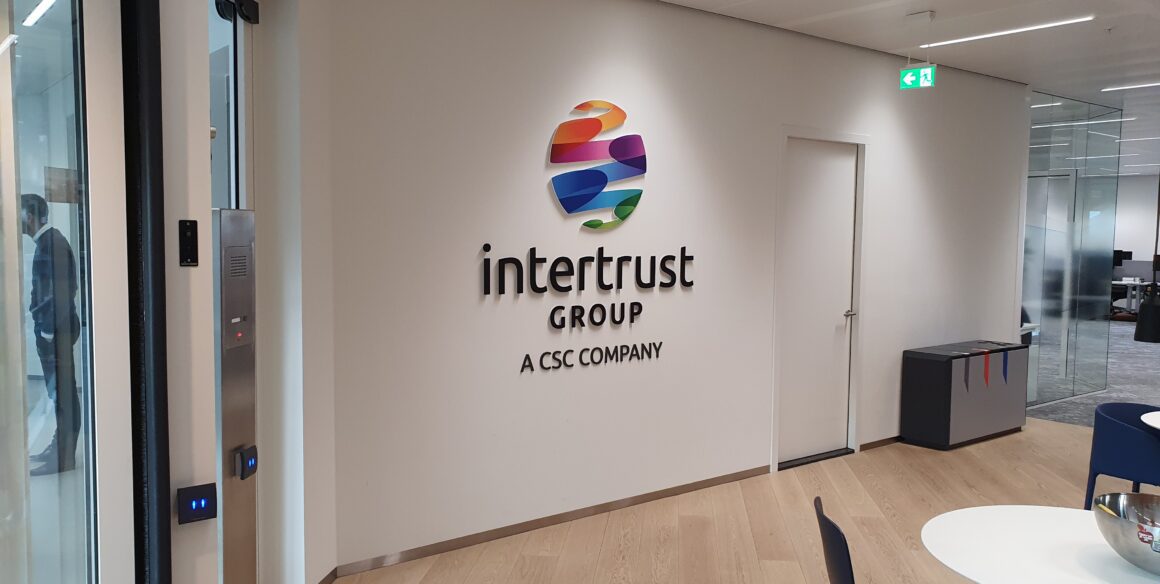
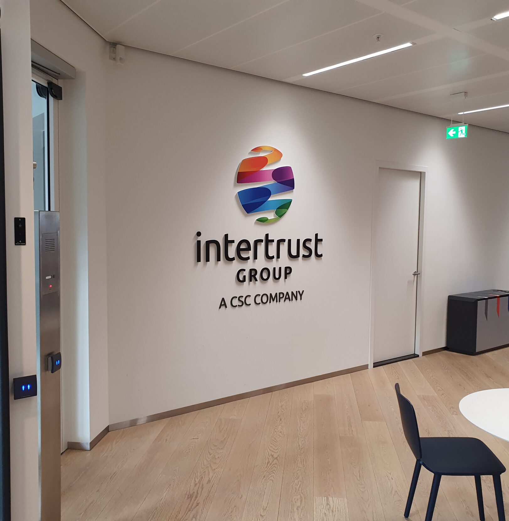
At the Intertrust headquarters in Amsterdam, a challenging project came to life, where interior branding went hand in hand with privacy and functionality. This unique assignment emerged from RGN’s previous involvement during the global rollout of Intertrust’s newly developed brand identity, in various locations. Our goal was to showcase the new logo throughout the entire building in an appealing manner. Maintaining transparency was a top priority while simultaneously dealing with confidential information. This resulted in a fascinating challenge: how do you warrant privacy while preserving transparency?
A true challenge
RGN was tasked with incorporating the ribbons, coloured lines and waves that represent the Intertrust brand identity design, throughout the entire office without compromising privacy and transparency. This proved to be a true challenge, but we fully committed ourselves to excel in this endeavour.
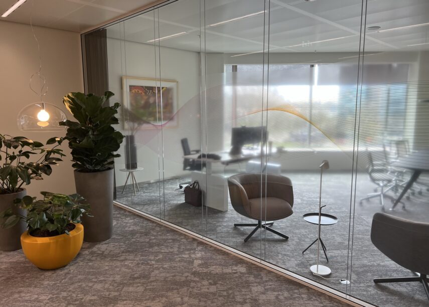
Privacy in a Transparent Environment
Extensive printed, self-adhesive film testing was conducted with various materials to achieve the desired balance. Some vinyls provided sufficient privacy but created the sensation of closed spaces that did not align with the desired transparent character of the office. Other vinyls had precisely the opposite effect. After thorough research, we discovered that using translucent ink for the ribbons on transparent film provided the solution. This choice perfectly aligned with Intertrust’s wishes. As seen in the image, the office spaces are now exceptionally open and transparent while ensuring optimal privacy. Only the contours are visible, while the content on the screens remains fully protected, thus keeping confidential information secure.
A Touch of Colour and Recognisability: Impactful Branding
This project harmoniously combines functionality with interior branding, where the use of colour also plays a significant role. Multi-coloured ribbons have been applied at entrances and open work areas, while monochromatic ribbons are used in meeting rooms, quiet rooms, private spaces, and executive offices. Furthermore, the colourful Intertrust logo has been strategically overlaid on the building’s floor plan, giving each section a unique colour. This clever colour coding enhances recognisability and supports intuitive wayfinding within the office.
In close collaboration with Intertrust, we have achieved a design that is not only effective and aesthetically sound but also reflects the brand identity of Intertrust. This project is proof that interior branding and privacy are not mutually exclusive but can instead go hand in hand. Are you ready to strengthen your own unique brand identity? Contact RGN today and discover the possibilities for your organisation. Together, we will create an environment where your brand shines without compromising important core values such as privacy.


Or call us now at +31 88 987 99 00

onze nieuwsbrief
